
Call
Lightspeed Theme Mandrill documentation
Ratio’s of the images:
All the images within Theme Mandrill do not have fixed ratio, because Theme Mandrill is fully responsive.
The headline and banner images scales are chosen depending on the selected screen size and aspect ratio, and serve as background image. The images are scaled such that at a smaller viewing ratio parts are cut off. For that reason, we recommend to not insert text in the image, but rather to use the text fields in settings. We also recommend centering the most important content in the image as much as possible and using a minimum width of 2,500 pixels, so that large images can also be displayed well on large screens. In addition, you determine the final size of the image yourself. For mobile and tablet in an upright relationship, we have also created separate input fields for the headlines. Again, there is no fixed ratio here, but you can use 800 x 600 mega pixels as a starting point.
The same goes for product images; they are also automatically scaled, but will not cut off. As a starting point, you can use the following pixel ratios: 300 x 300 (square), 400 x 300 (horizontal) and 300 x 400 (vertical). For category images on category overviews and the homepage, you can use a pixel ratio of 500 x 350.
Only €299,-
Need help with filling up your theme?
Take the tour
Get to know all features.
We love to help you!
Customization needed?
Changelog
01-03-19
bugfix
09-10-18
bugfix
01-10-18
feature
Stay up-to-date about news and updates!
Documentation.
-
General
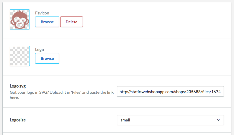
Logo
Upload your own favicon and logo. You can upload your logo in JPG and PNG, but we’ve also made it possible to upload your logo in SVG. First, upload your SVG logo to files and copy the file URL (see video). Be aware: the SVG overwrites the added JPG or PNG so that when both a JPG/PNG and a SVG logo are added, the SVG logo will be shown.
Besides that it is possible, after choosing a logo, to choose from three different formats.
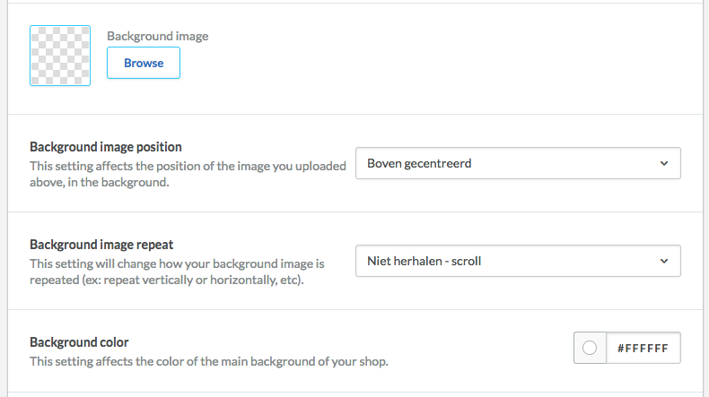
Background
It is possible to choose set a background color or background image by uploading one. Then you can change the position and choose to have the image repeated.
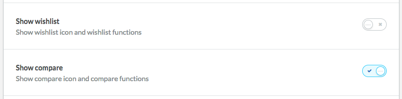
Wishlist & Compare
You can switch the functions ‘Wishlist’ and ‘Compare’ on and off. When activated, the icons ‘Wishlist’ and ‘Compare’ will be visible. When not activated, these icons will not be visible.
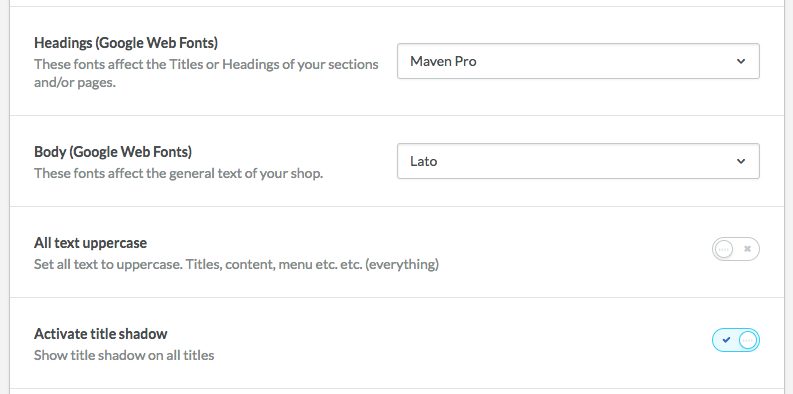
Font
For titles and other textual content, you can set the font independently. Besides that it is possible to show all content in capital letters or to add shadows to all titles.
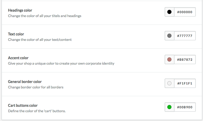
Colors
Configure the colors of your corporate image here.
-
Header
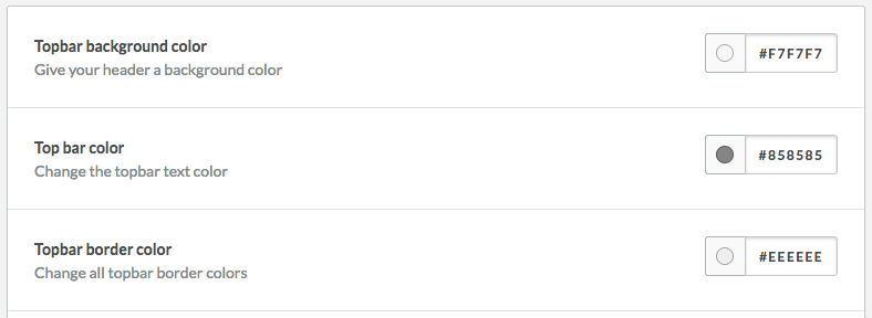
Topbar
When activated, currencies and languages will be shown in the topbar. You can also change the background color, border color, and text color yourself.
On the left of the topbar there is a phone number in the preset, but this could also be a general text. If you want to change this text, in the backoffice you can go to ‘Content => Translations’ and search for the ‘topbar-phone-number’ key. Click on that key and change the topbar text for all set languages.
Header
Change the background, icons, and border color here to your liking.
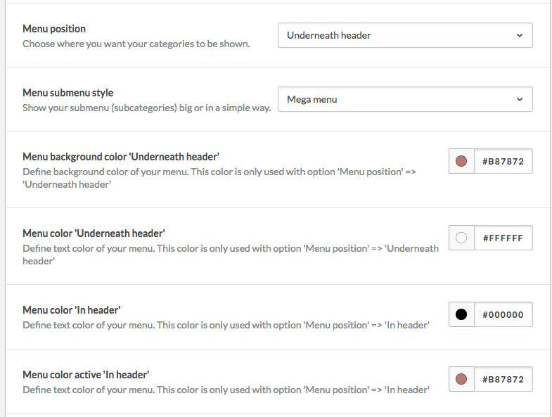
Menu
Two standard menu positions have been built into the theme. You can choose for yourself which menu suits you best;
In header: The menu will appear to the right of the logo in the header. With this variant, a mouseover will not show any subcategories.
Underneath header: The menu will be stretched out along the full width beneath the logo. With this variant a mouseover will show subcategories.
Color setting have been made for both these menu variants. Notice that the color settings depend on the chosen menu variant.
USP bar
If you have USPs (Unique Selling Points), you can show them by activating the USP bar. The USPs are linked to ‘Content => Translations’. Add the following keys to ‘Translations’ to change the USPs.
- usp_1_title
- usp_2_title
- usp_3_title
- usp_4_title
You can also change the colors fort he USP bar to your liking.
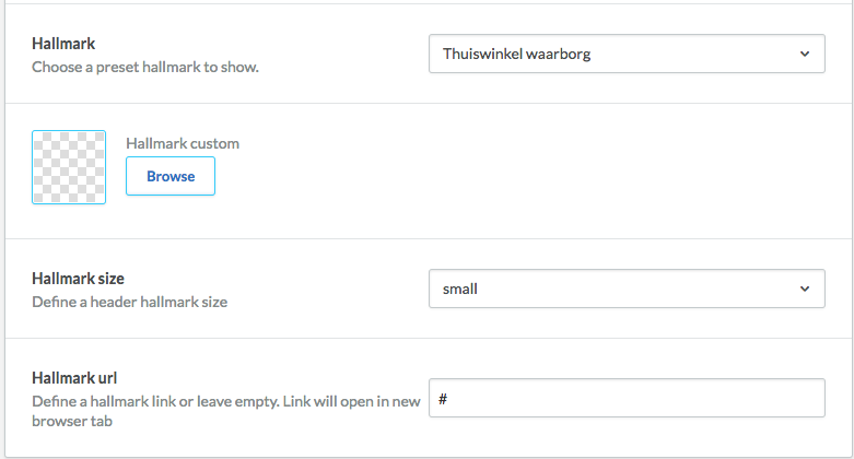
Certification marks
Within the theme it is possible to quickly and easily add certification marks. For the Dutch market you can, via the dropdown and without having to upload an image, add Thuiswinkel Waarborg, Thuiswinkel Keurmerk, Webshop Keur, or Qshops. If you want to add an image or an alternative certification mark yourself, you can choose ‘Own hallmark (upload below)’ in the dropdown and then upload a certification mark image (JPG or PNG) yourself.
In the input fields below you can then set the size of the certification mark logo and where it should link to. The entered link will open in a new window automatically. If you do not add a URL, the certification mark logo will not link to anything.
-
Homepage structure
Settings
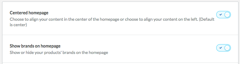
Here you can choose if you want to outline all textual content on the left or in the middle.
You can also select if you want brand logos to be visible or not.
Homepage blocks
Using the dropdown you can easily decide in what order you would like all content on the homepage to be shown. Choose which elements are shown in what order.
If you don’t want a block tob e shown, choose ‘No’ in the dropdown.
-
Homepage headline settings
Settings
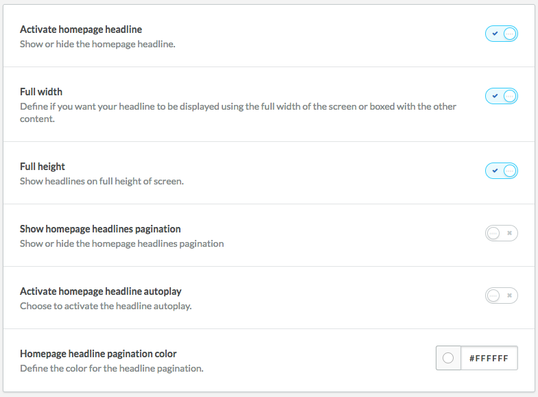
Would you like to show a slider with headline images beneath the header? Activate the homepage headline. When activated you can choose if you want to show the headline images in the slider fullscreen across the width or within the shop’s container. If you have chosen to show the image across the width, you can also choose to have it shown in height across the width.
Besides that, you can switch headlines’ pagination on or off and provide the pagination with a desired color.
Activate ‘Autoplay’ to make sure the slider slides automatically. If this is not activated, the images will remain still and can be moved by swiping or using pagination to navigate to another image (if multiple are added).
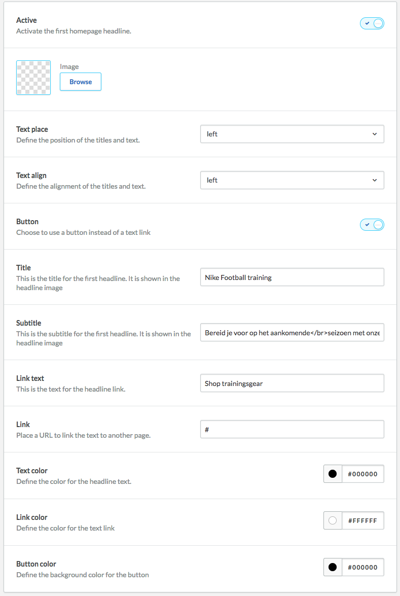
Homepage headline (1/2/3)
In the theme you can add three headlines (headline images) by default. Before you add a headline image you have to activate the headline image first. When activated and when you have uploaded a headline image, you can then enter text and position the text on the headline per headline. On top of that, you can place the URL, where the headline image has to link to, as text link or button. At the bottom you can then manage the text color, text link and/or button.
WARNING: When entering the URL, only enter all that comes after the ‘/’. So only what comes after 'http(s)://www.domeinnaam.nl/'.
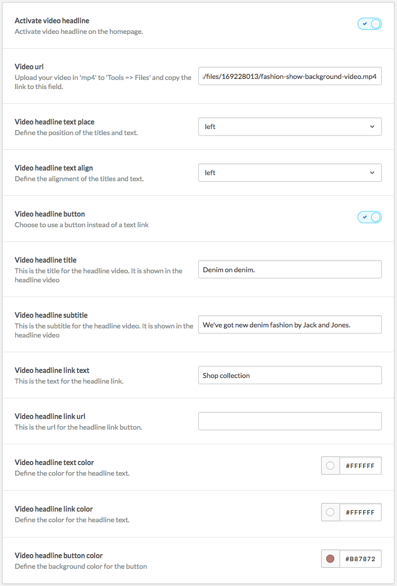
Video headline
You can also play a mp4 video in the slider. It’s important to activate this video headline above this setting first. Then you will need to enter the mp4 video’s URL into the input field (see the description fort his setting in the backoffice). Below, you can then change the titles, texts, their placement and color.
-
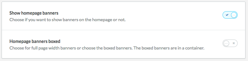
Homepage banners
Settings
The theme has the option to show two banners. If you want to show banners, activate them first. It is also possible to display them ‘boxed’. If they are displayed ‘boxed’, the banners will be displayed across the width against each other. If you do not choose this option, the banners will be displayed smaller and with a small white space between them.
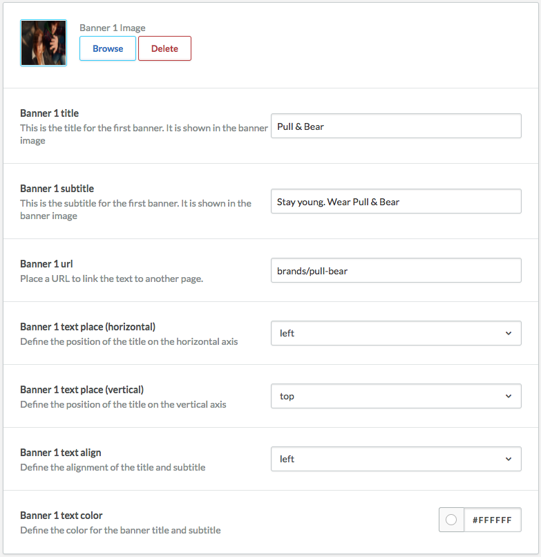
Homepage banner (1/2)
You can upload an image for both banners yourself. Below, you can then indicate what titles the banners should have, where they should link to, and where the titles and URLs should be placed.
WARNING: When entering the URL, only enter all that comes after the ‘/’. So only what comes after 'http(s)://www.domeinnaam.nl/'.
-
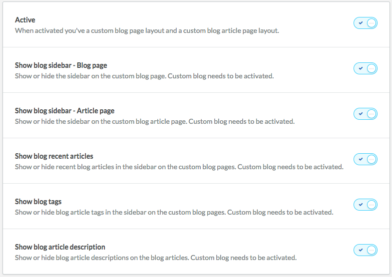
Custom blog
Settings
If you have any blogs, you can show them with the default ‘Lightspeed way’ or with the custom solution in Theme Mandrill. Activate the custom blog display if you want to use this.
After that you can use the other setting to indicate what components you do or do not want to show on the blog overview or product page. For more information you can go to the description beneath the settings in your backoffice.
-
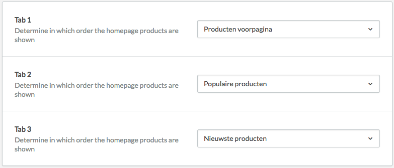
Homepage products
Settings
If you want to show products on the front page, you add this via ‘Products front page’ in Lightspeed. Products that are linked to this setting can be found under ‘Featured products’ in the dropdown.
Within the theme there is also the possibility to add two tabs with products; ‘Popular products’ and ‘New products’. The popular and new products cannot be managed by yourself, Lightspeed feeds these automatically. The popular products are those that have the most page views and the newest products are the products that have been added most recently.
-
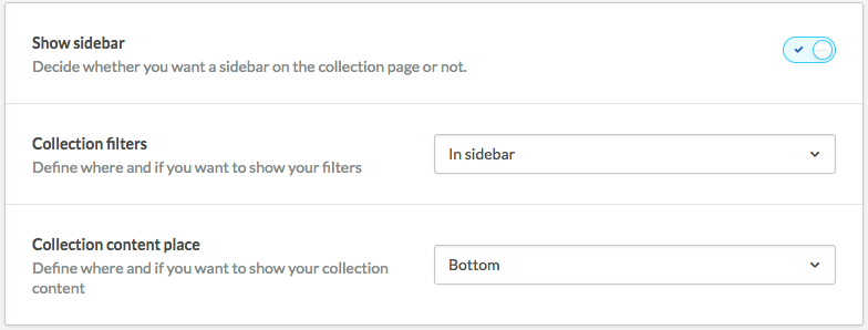
Collection
Settings
Within the theme you can choose from three different collection pages (products overviews). You can choose whether you want to show a sidebar, whether you want to show filters, and if yes, whether you want to show these filters in the sidebar or on the top of the page. If you choose the last option, the filters will be hidden behind a button that will only become visible if you click that button. Besides that, you can indicate if you want to show a category’s textual content on the top or bottom of the page.
Collection product settings
Within the theme you can configure how you want products on the homepage, products under related products, and products on category pages/ product overviews to be shown. For example, you can choose to have your product shown small or large. If you want to show it large, the display changes and the row will show one product less (desktop version).
You can also choose if you want to show the quick-view option, to use spacing, to show star ratings, to have all images shown in the same size, to show the short description of a product (and if yes, how many rows), and more.
For more information you can go to the description beneath the settings in your backoffice.
-
Sidebar
Settings
Here you can change the settings for the sidebar (left side) of the category pages. You can choose whether you want to show the sidebar or not. And if you do, you can indicate here if you want to show the number of products in a subcategory between brackets.
-
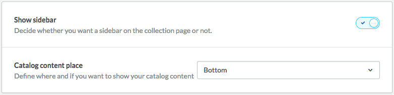
Catalog
Settings
Here you can choose to show a sidebar on category overviews (catalog pages). You can also choose whether you want to display textual content on the top or bottom of the page.
-
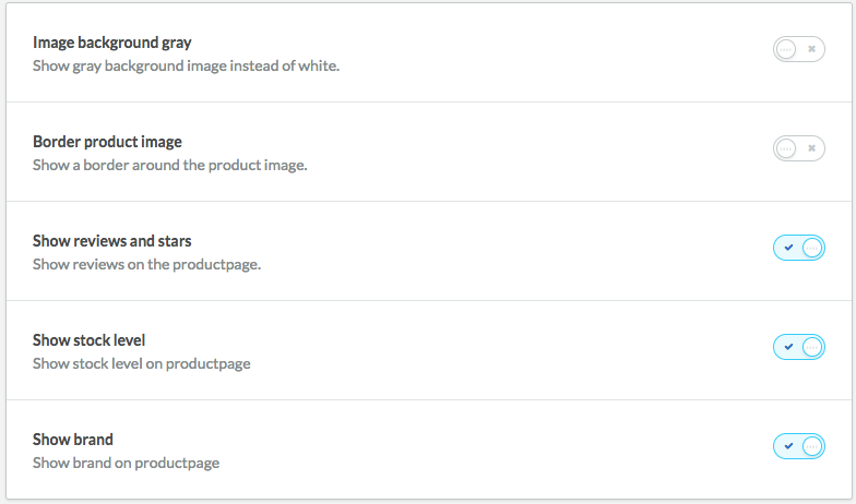
Product detail page
Settings
Within the theme you decide what content will and will not be shown on the product page. For example, you can activate or deactivate a line around the product image, set the background color of the product image to grey instead of white, or more. For more information you can go to the description beneath the settings in your backoffice.
-
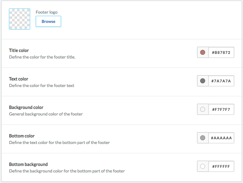
Footer
Settings
If you want to show a logo in the footer you can upload one under ‘Footer logo’. In these settings you can also change the content’s color and footer’s background color.
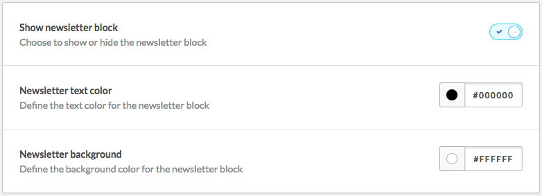
Newsletter
Activate the block for newsletter application here. When activated, you can also change the text- and background colors here.
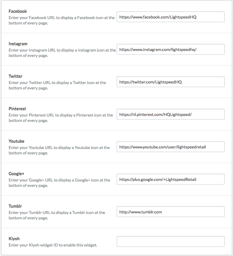
Socials
If you want to show and link socials, enter the social media pages’ URLs. If you do not enter a link, the social media icon will not be shown.
-
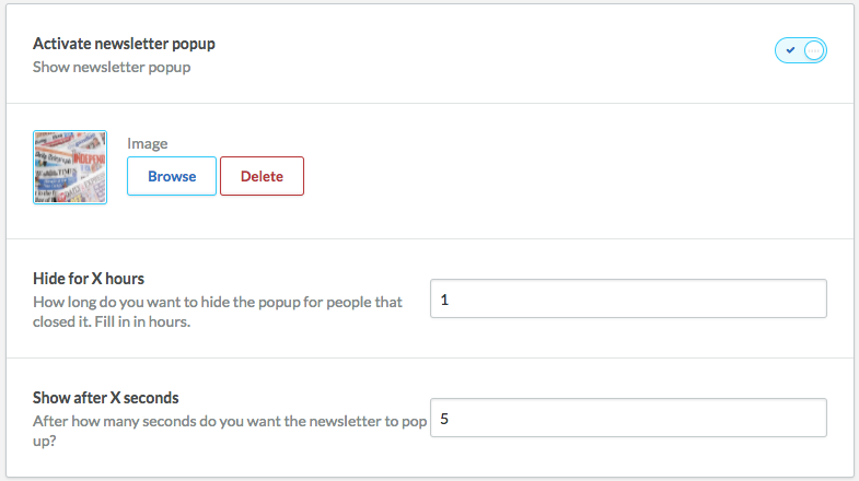
Newsletter popup
Settings
Within the theme there is a setting for a newsletter pop-up by default. When activated you can upload an image. You also choose the number of hours that go by for a pop-up to appear again at a next visit after closing it and you can indicate after how many seconds the pop-up has to appear at a visit.